Wikipedia:To scale charts
This is an essay. It contains the advice or opinions of one or more Wikipedia contributors. This page is not an encyclopedia article, nor is it one of Wikipedia's policies or guidelines, as it has not been thoroughly vetted by the community. Some essays represent widespread norms; others only represent minority viewpoints. |
| This page in a nutshell: While some charts may contain accurate data, if not done to scale they may present readers with the wrong impression. |
So you have a chart or graph that you think will improve an article. But does the visual impression accurately reflect the underlying data?
Interval scale charts
[edit]Examine the following interval scale chart. By examining the height of the bars, there seems to be as twice as many cats that are pets compared to dogs. Note the scale of the Y axis starts at 74 million.

Ratio scale charts
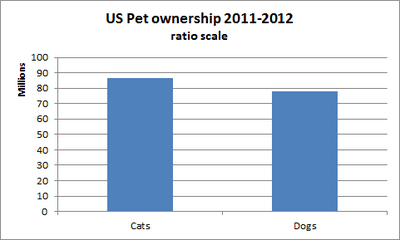
[edit]Now look at the following ratio scale chart, where the scale starts at zero. The visual difference between the bars representing cats and dogs is much less noticeable. This because the ratio scale chart shows the entire range of data.

Using interval charts to deceive
[edit]Though each chart uses the same data, the ratio scale chart presents a visual that accurately presents the data. In the above examples, the interval chart shows a magnified subsection of the ratio chart. A common example of this type of interval magnification is used in charting stocks. A chart may indicate severe price swings because the chart only shows a portion of the range. When the entire price range is shown, the volatility is much less noticeable. A stock broker who earns fees from commissions can take advantage of interval ratio charts by using perceived volatility to encourage their customers to place more orders.
When using charts and graphs in articles, make sure the visual representation of the data is not deceptive.
See Also
[edit]- Level of measurement
- How to Lie with Statistics which has much more on the misleading use of graphics.
